01
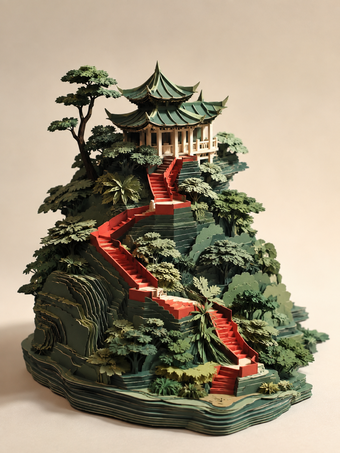
Make paper architecture spatially convincing
Use entrances, routes, support and paper thickness to give a paper landmark more than an attractive silhouette.
Read articleVisual Prompts · Journal
Ten concise articles unpack decisions behind architecture, product, education, object, character and brand visuals. Each starts from a work on this site and sets out a reusable method, review points and limits.
Use entrances, routes, support and paper thickness to give a paper landmark more than an attractive silhouette.
Read article
Define the silhouette, material, use context and light separately to make commercial imagery easier to read.
Read article
Organize apparatus, sections and stages around one causal relationship rather than a decorative science scene.
Read article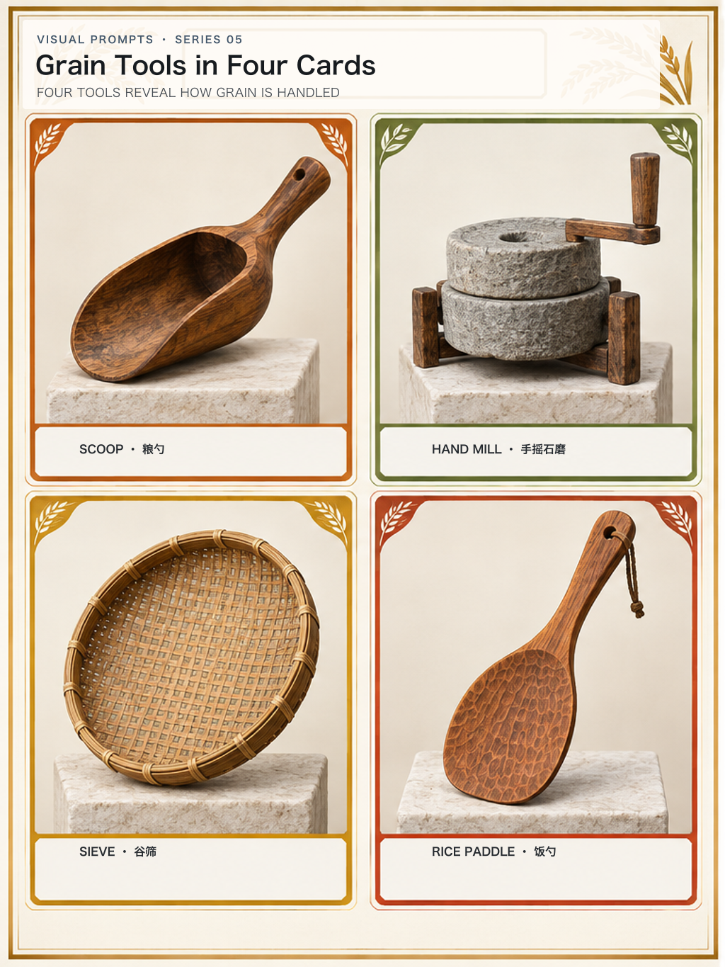
Use consistent scale, a stable grid and a separate text layer so four objects can actually be compared.
Read article
Build from recognizable plant forms, seasonal cues and coherent light rather than relying on haze and palette alone.
Read article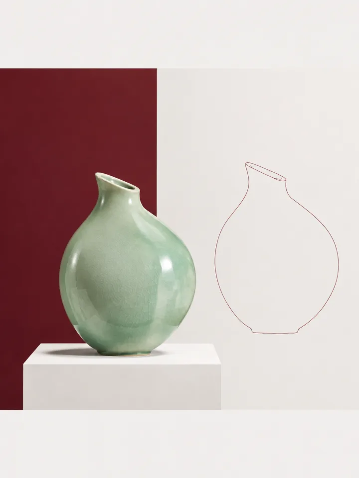
Start from observable structure, material and use without presenting a concept design as a historical reconstruction.
Read article
Build a story from a goal, action and environmental response rather than an attractive pose.
Read article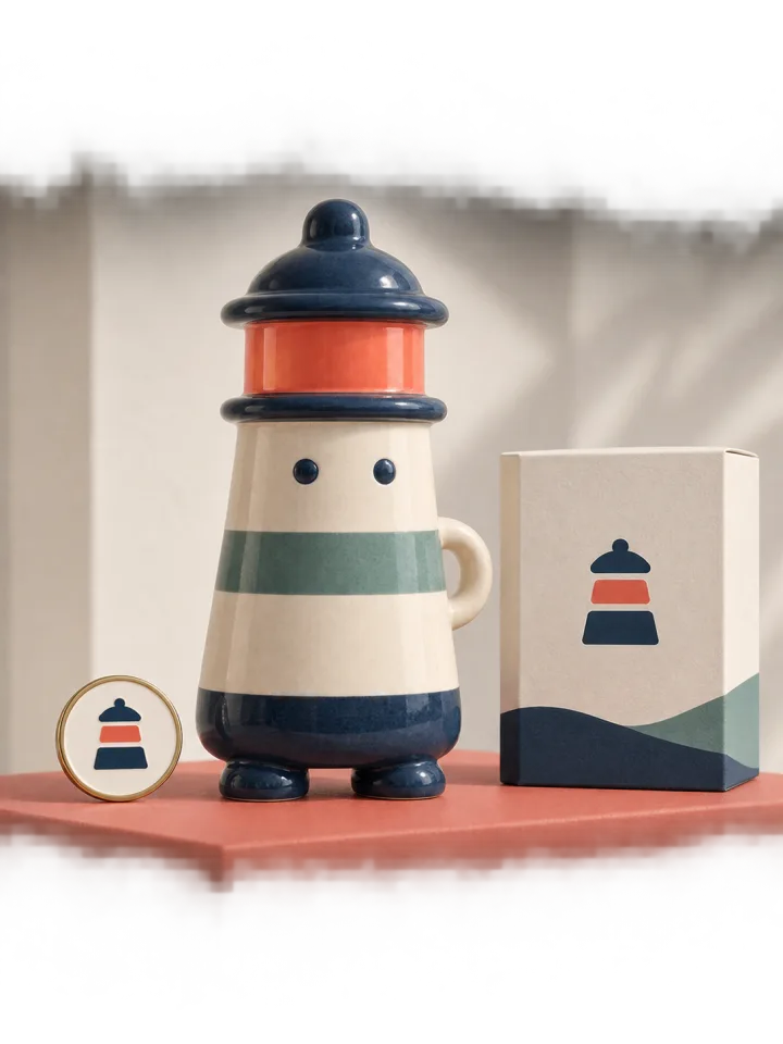
Fix the identifying features first, then vary scene, expression and use one decision at a time.
Read article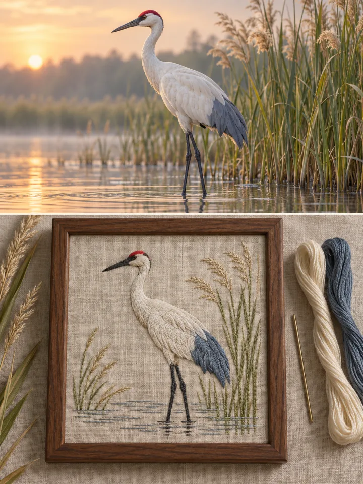
Paper, embroidery, clay and glass are not filters; each material brings its own structural rules.
Read article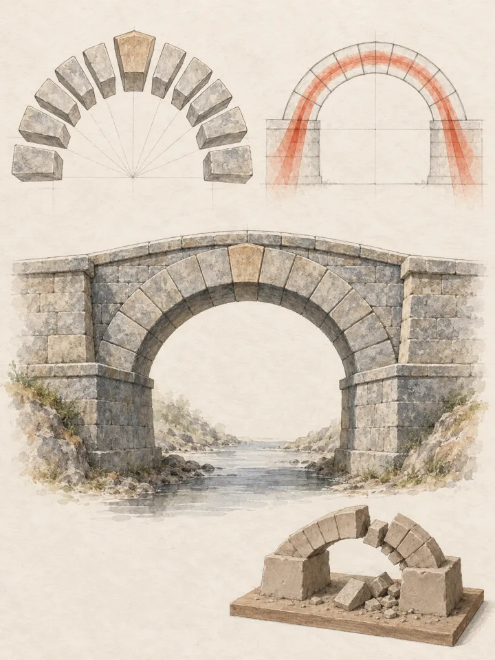
Check subject, space, material, text and facts in separate passes before calling an image ready.
Read article